But I made the attempt anyway. And here is what I did.
On my first banner, I started with the big, blown-up cover of the book that my cover artist sent me and went into fotoflexer.com. After uploading the entire cover, I went into "crop" under the "BASIC" tab. And I cropped out the portion I wanted to keep for the banner. I resized and then flipped and rotated until I got it where I wanted it.
Then I checked out the EFFECTS tab for this particular banner and chose the "lomoish" option to make it a funky coloring.
(by the way, to make a picture out of what I saw on my screen, I googled and found out you push the print-screen button--might look like "PrtScn," then go into an image editing program--hint, hint: Microsoft Paint--and chose the paste option. I just discovered this and had to share!)
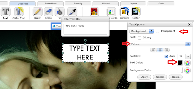
I found the adding-text feature under the DECORATE tab. You can make the text box transparent. You can move it where you want it, tilt it, change size, color, and there are some different font options. So I played around and experimented with those until, voila, I came up with this banner!
It might not be the best banner I've ever seen, but it wasn't the worst either! Except, I wanted more, MORE!
The next attempt at a banner was a bit more detailed. I'm not sure if it came out looking better or worse, but...here's what I did.
I found a free photo reflection site, reflextionmaker.com, and uploaded my book cover from my computer. If I had wanted my banner background to be white, I would've pressed "generate" then. But, no, not me. I had to be difficult.
So, I picked a background color I thought matched the title font, and wrote down the 6-digit color code that for it once I chose it (it was 880015 in this case). And THEN I generated the new picture. After the new "reflected" cover generated, I hovered my mouse over it and pushed the right button, chosing "save picture as" to get it stored as a file on my computer. These reflection people like donations, so if you want to leave a little something-something for them, that's cool.
In the next step, I needed more numbers for my 6-digit background color code (880015, remember?), so I went to http://tech.pro/tutorial/653/javascript-interactive-color-picker and scrolled down until I found this nifty interactive color picker thingy. I typed in the 6-digit code of the color (880015) in the HEX box and then clicked into another box so all the rest of the code numbers I needed would pop up. Then I wrote down the new numbers that came up in the red, green, and blue boxes. (red was 136, green 0, and blue 21)
After I used my little Microsoft Paint bucket to fill the entire banner, I had my nifty new background color. But who wants one boring color for their background?? To make it multicolored, I put some black lines in and filled in a black chunk. Two-toned!
I found my reflected cover I'd saved on my computer, and opened it in a new Microsoft Paint program. I resized the picture so it would fit onto my banner (maintaining aspect ratio, of course) and then chose "select all". (Actually, it'd probably be better if you re-sized in Microsoft Office Picture Manager before you even do the reflection stuff for a better chance of keeping the cover having a better quality image. But alas, I forget that step)
After a quick CTRL + C to copy what I had selected, I went back into the Paint program with the blank two-toned banner background waiting for me. Then I hit CTRL+V to paste in my cover, and I moved it until I got it where I wanted it.
I could have added some text straight from Paint, but putting text on a picture in the Paint program always seems to come out grainy and gross, IMHO. At this point, I saved that picture into my computer, and back to FotoFlexer I went to add some text. (actually, the quote part of this banner WAS written in the Paint program, so you can actually see how much grainier it looks than the rest for the fonts).
AND here is what my second quote banner looked like.
I think banners are a neat promotional item for authors. It makes a nice visual touch and adds color and some life to your blog, website, Facebook page or whatever.
You can always go the fancy route and pay a professional to make you really good banners. Those are amazing. Or you can purchase an image-editing program to make it easier to do. Someday, I'm going to do that (Sigh. Someday). And if you already have such a program...I'm so totally jealous of you. Grr. Or you can do it this free, inventive way. Whatever works for you!
So, do you have any cool banner-making tips to share with me? I'm all ears over here, always looking for a helpful way to promote. Since I was self-taught in this art, there's so much more I want to (and really need to) learn about this aspect of advertising!
PS: I ended up making seven banners total for this book. Here's a peek at one more! Which one is your favorite?


Not certain I followed everything you did. I like the second and third ones.
ReplyDelete